Long before you consciously register the subject of a painting, its palette has already done something to you. Colour hits the eye and the nervous system faster than shape or composition, which is why two paintings of the same size in the same spot on a wall can leave a room feeling entirely different, one calm and settled, the other charged and alive. Understanding a little about how colour actually affects mood makes choosing art for a home far less of a guessing game.
This isn’t about rigid rules. It’s about knowing what warm reds tend to do to a room versus cool blues, so that when you’re standing in front of a painting deciding whether it belongs in your bedroom or your dining room, you have more to go on than instinct alone.
Why Colour Affects Mood More Than Subject Matter
Human colour perception is tied directly into the nervous system in ways that predate language and conscious thought. Warm, high-energy hues, reds, oranges, bright yellows, tend to raise heart rate and alertness slightly, which is part of why they show up so often in spaces meant for activity and conversation. Cool hues, blues, greens, soft violets, tend to have the opposite effect, associated with calm, rest, and lowered arousal, which is why they dominate bedrooms and spas far more often than dining rooms. This response happens well before you’ve processed what the painting is actually depicting, a red abstract piece and a red landscape will produce a broadly similar emotional undertone in a room, even though their subjects have nothing in common. That’s the part worth remembering when choosing art, the colour palette often matters more to the room’s felt mood than the subject does.
How the Eye Actually Processes Colour
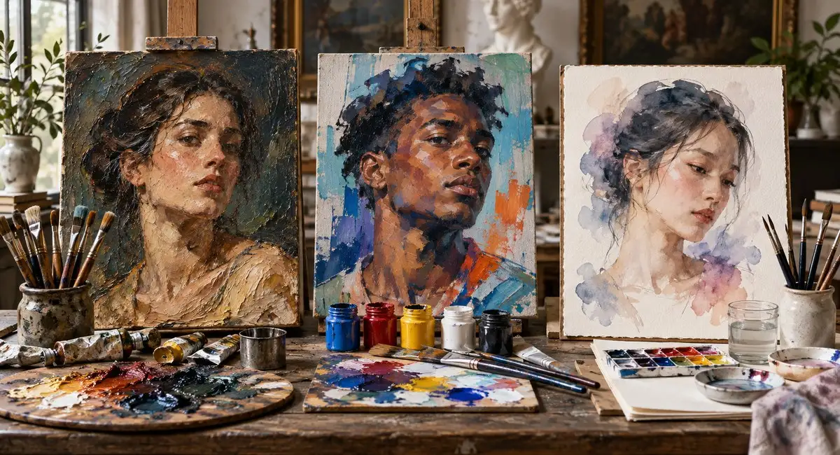
Before colour ever reaches the realm of association and memory, it is registered physically, wavelengths of light striking receptors in the eye and triggering signals that travel to the brain faster than the slower, more deliberate process of recognizing a painting’s subject. This is part of why colour can affect mood almost instantly, in the fraction of a second before you have consciously identified what a painting depicts, its dominant hue has already begun shaping your physiological state, subtly shifting alertness, calm, or arousal. Painters have understood this intuitively for centuries, long before formal colour theory existed, which is why a portrait painter reaching for a warm flesh tone or a landscape painter choosing a cooling blue-grey for distant hills isn’t just working from observation, they’re also working with an effect on the viewer that goes well beyond simple visual accuracy.
Warm Colours: Energy, Warmth, and Appetite
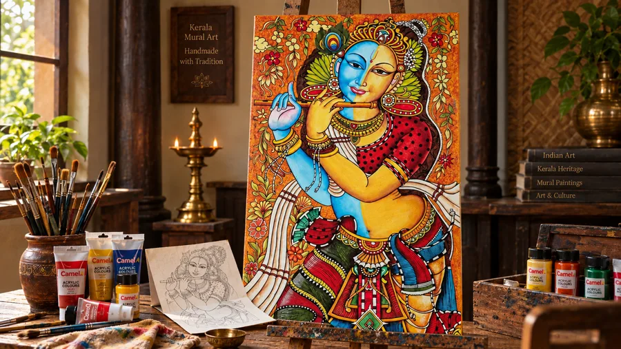
Reds, oranges, and warm yellows bring energy and sociability into a space, and they’re closely tied to appetite, which is exactly why so many dining rooms and kitchens lean toward warm-toned art and decor. A red or orange-heavy painting in a living room tends to encourage conversation and activity, making it a strong choice for a space built around gathering rather than quiet retreat. The tradeoff is that warm, saturated colour can feel overstimulating in a room meant for rest, a fiery abstract piece that feels perfect over a dining table can feel restless and hard to unwind near if it’s hung facing a bed.
Cool Colours: Calm, Focus, and Rest
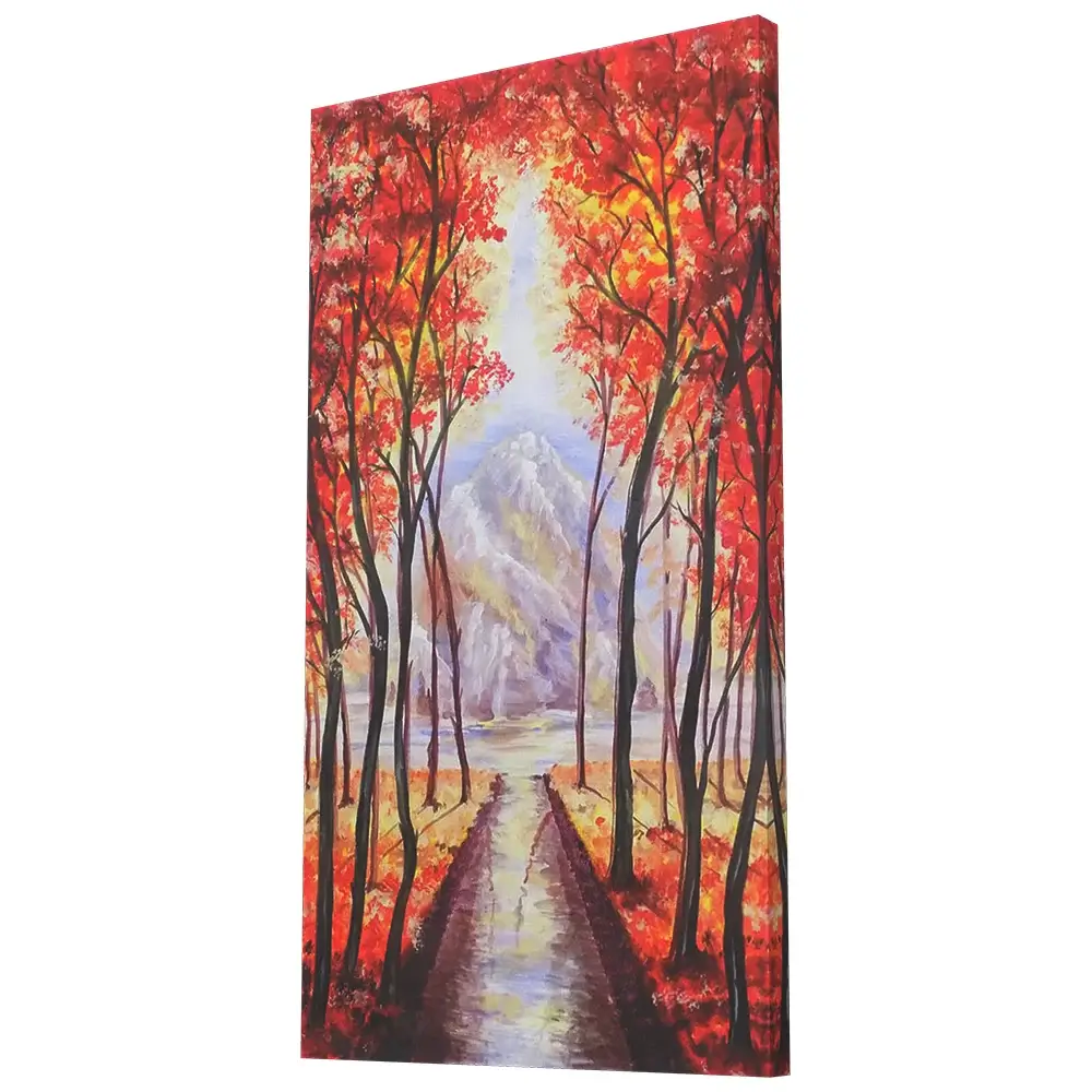
Blues, greens, and soft violets bring a settling, lowered-arousal quality into a room, which is exactly why they show up so often in bedrooms, bathrooms, and spaces meant for winding down. Blue in particular has a strong association with calm and trust, making it one of the safest, most broadly appealing palette choices for a shared space where you want to avoid anything too polarizing. Green sits close by, carrying an additional association with nature and renewal that makes it especially effective in home offices and reading corners, where a settled, focused mood supports the work happening in the room rather than distracting from it.
Neutral and Monochrome Palettes: Timeless, Adaptable Calm
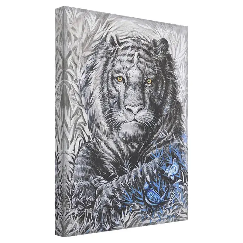
Black, white, grey, and sepia-toned paintings strip colour psychology’s most obvious effects out almost entirely, shifting the emotional weight onto contrast, form, and texture instead of hue. This makes monochrome art unusually adaptable, since it rarely clashes with existing decor and tends to feel timeless rather than tied to a particular design trend. It also tends to read as more contemplative and serious than colour-rich work, which is why monochrome pieces suit formal living rooms, studies, and hallways so comfortably.
Yellow, Orange, and the Emotional Extremes of Warm Colour
Within the warm family, yellow and orange behave a little differently from red. Yellow carries strong associations with optimism and cheerfulness, but in large, saturated doses it can also read as anxious or overstimulating, which is why designers often reach for it in small accents rather than as a painting’s dominant colour in a space meant for rest. Orange sits between red’s intensity and yellow’s brightness, often read as friendly, energetic, and approachable rather than aggressive, making it a popular choice for casual dining spaces and creative rooms where a bit of stimulation is welcome. Both colours tend to reward a lighter touch than red, a small, warm accent painting can lift a neutral room considerably without tipping it into overstimulation the way a large, saturated piece in the same hue might.
Matching Art Colour to a Room’s Function
A bedroom generally benefits from cooler, muted, or desaturated colour, art that supports winding down rather than art that energizes. A dining room or living room can comfortably carry warmer, more saturated colour, since those are rooms built around activity and social energy. A home office does best with either cool, focus-supporting colour or a calm neutral palette, since bright warm tones can be genuinely distracting during concentrated work. A hallway or entryway has more freedom than any other space, since it’s rarely occupied for long, making it a reasonable place to hang a bolder or more saturated piece you love but wouldn’t want staring back at you all day.
Colour Combinations and What They Communicate
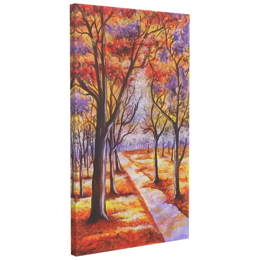
A painting rarely carries just one colour, and the combinations matter as much as any single hue. Complementary pairings, orange against blue, red against green, tend to feel vibrant and high-energy, drawing the eye and holding attention. Analogous palettes, colours that sit near each other on the colour wheel, blues into greens, reds into oranges, tend to feel more harmonious and easier to live with day to day. A painting built around a single dominant colour with subtle tonal variation, several shades of blue, for instance, tends to feel the calmest and most cohesive of all, which is part of why so many bedroom-appropriate paintings lean toward this kind of restrained palette.
Cultural and Personal Associations with Colour
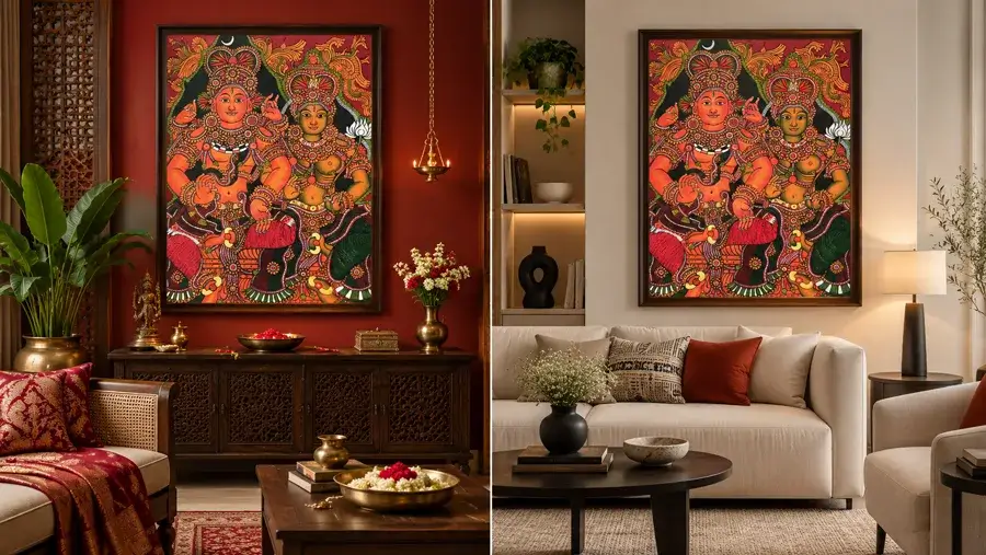
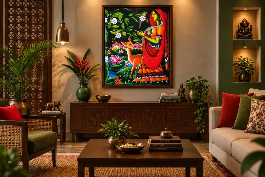
Colour psychology isn’t purely universal, cultural background shapes some associations significantly. In many South Asian traditions, red and gold carry strong associations with prosperity, celebration, and auspiciousness rather than the alarm or urgency they’re sometimes linked to elsewhere, which is part of why they appear so often in festive and religious art. White, associated with purity and simplicity in many Western design contexts, carries mourning associations in some other cultures. None of this means you need to overthink every colour choice, but it’s worth being aware that your own personal and cultural associations with a colour may matter more to how a painting feels in your home than any generic psychology chart.
Choosing Colour Based on How You Actually Use a Room
The most reliable approach isn’t memorizing a colour chart, it’s thinking honestly about how you use the room and what mood supports that use. A living room where you host frequently benefits from different colour energy than a living room that’s mainly a quiet reading spot for one or two people, even though both are technically the same room type. If you already know a room feels chaotic or overstimulating, a cooler or more muted painting can help settle it, and if a room feels flat or underused, a warmer, more saturated piece can genuinely change how often you want to spend time there.
Layering Colour Psychology with Existing Decor
A painting’s colour doesn’t exist in isolation, it interacts with your walls, furniture, and textiles. A warm, saturated painting against an already warm-toned room, terracotta walls, wood furniture, amber lighting, tends to amplify that warmth further, which can feel cozy or overwhelming depending on how much warmth is already present. A cool painting introduced into a warm room can act as a helpful counterbalance, tempering the space rather than fighting it. When in doubt, it’s worth photographing the room and the painting together, or at least holding a printed swatch of the dominant colour up in the space, before committing, since colour reads very differently under a room’s actual lighting than it does on a screen.
Seasonal Light and How It Changes a Painting’s Colour

A painting’s colour is never fixed, it shifts with the quality and colour temperature of the light falling on it throughout the year. Warm afternoon sunlight tends to intensify a painting’s reds and oranges while muting its blues, and cooler, overcast daylight does close to the opposite, drawing out blues and greens while dulling warm tones. Artificial lighting adds another layer, warm incandescent or warm LED bulbs push every colour in a painting slightly toward amber, while cooler daylight-balanced bulbs keep colours closer to how they appear in natural midday light. A north-facing room with consistently cool, even light will show a cool-toned painting at its truest, while a west-facing room with strong evening sun will amplify warmth in whatever art hangs there. None of this means you need to obsess over compass directions before buying a painting, but it’s worth walking the intended wall at a few different times of day before committing to a piece whose colour mood matters a great deal to you.
Common Mistakes to Avoid
The most common mistake is choosing a painting purely for its subject and only noticing its colour effect after it’s already on the wall, a beautifully painted but intensely warm piece can feel wrong in a bedroom regardless of how much you love the imagery itself. The second is assuming colour psychology is a strict rulebook rather than a general tendency, personal association and room lighting can shift how a colour actually feels far more than any generic chart predicts. The third is over-correcting into an entirely neutral, colourless home out of caution, which can leave a space feeling flat rather than genuinely calm, a little intentional colour, chosen with the room’s function in mind, usually adds more than it risks.
Colour Psychology for Original Paintings vs Prints
Colour accuracy matters more for this kind of decision-making than people often expect, and it is one more reason original paintings tend to serve colour-conscious buyers better than mass-produced prints. A giclee or poster print reproduces colour through a fixed set of inks and a calibration process that can shift subtle tones, especially in the mid-range blues and warm neutrals that carry so much of a painting’s emotional weight. An original canvas, by contrast, carries the artist’s actual pigment, mixed and layered by hand, which tends to hold richer, truer colour under a wider range of lighting conditions than a printed reproduction can consistently match. If a painting’s specific colour mood is the main reason you are drawn to it, that is a solid argument for choosing an original over a print of the same composition.
Testing a Colour Before Committing
If you’re genuinely unsure how a painting’s colour will feel in daily life, live with a printed image of it taped to the intended wall for a few days before buying, or ask about viewing the piece in natural daylight if you’re purchasing in person. Pay attention to how the colour feels at different times of day, a warm piece that feels wonderful in evening lamp light can feel considerably more intense under harsh midday sun. This small bit of patience upfront tends to prevent the most common regret with colour-forward art, buying something that looked perfect in a photo but feels overwhelming once it’s actually living in the room full time.
Frequently Asked Questions
What colour painting is best for a bedroom?
Cool, muted, or desaturated palettes, soft blues, greens, or gentle neutrals, generally support rest best. Save the most saturated, high-energy colour for rooms built around activity.
Does colour psychology in art actually have scientific backing?
There’s real research on how colour affects arousal and mood generally, though individual and cultural variation is significant. Treat it as a useful general tendency rather than a strict rule for every person and every room.
Can a monochrome painting still have a strong mood?
Yes. Monochrome and neutral-toned work shifts the emotional weight onto contrast, texture, and composition rather than colour, and can feel just as evocative as a colour-rich piece, often in a calmer, more contemplative register.
Should every room in a home follow the same colour logic?
No. Different rooms serve different purposes, and it’s entirely reasonable, even ideal, for a home’s art to shift in tone from a calm, cool bedroom to a warmer, more energetic living or dining space.
Is it better to match art colour to my walls or to contrast with them?
Both work. Matching creates a calm, cohesive look, while a well-chosen contrast makes the painting the clear focal point of the room. The safer default for most homes is a painting that shares at least one undertone with the walls while still standing out enough to draw the eye.
The Takeaway
Colour does real, measurable work on mood before a painting’s subject even registers, which makes it one of the most useful things to think about when choosing art for a specific room. Match warm, saturated palettes to social, active spaces, cool and muted palettes to rest and focus, and let personal association guide the rest. Get that right, and a painting does more than decorate a wall, it actively shapes how the room feels to be in.
Explore our full collection of original paintings, hand-painted on canvas by our artists in India.