
A gallery wall is one of those decor ideas that looks effortless when it’s done well and looks chaotic almost immediately when it isn’t. There’s rarely much middle ground. The good news is that the difference between the two usually comes down to a handful of planning decisions made before a single nail goes into the wall, not artistic talent or an expensive art collection.
Here’s a genuinely practical, step-by-step approach to building one that actually works.
What Makes a Painting Work on a Wall
A successful gallery wall isn’t really about the individual paintings, it’s about the relationships between them: consistent spacing, a shared visual thread (color, subject, frame style, or all three), and a clear overall shape that the eye can follow. Remove any one of those three elements and even a collection of genuinely beautiful individual paintings can end up looking like a random accumulation rather than a considered arrangement.
Step 1: Choose Your Unifying Thread
Before choosing individual pieces, decide what’s going to tie the whole wall together, because trying to figure this out after you’ve already bought several paintings is much harder than starting with the decision. The three most reliable unifying threads are color (all pieces share a palette, even if subjects vary widely), frame style (identical or closely matching frames across very different paintings), and subject (all animal paintings, all landscapes, all abstracts). Mixing two threads, say, varied subjects united by both color and frame style, tends to produce the most polished, intentional-looking result, though a single strong thread is enough to hold a wall together.
Step 2: Decide on a Layout Style
There are three broad approaches, and picking one before you start hanging anything will save you from a lot of second-guessing partway through.
- The grid layout — identical or very similarly sized pieces arranged in even rows and columns, with consistent spacing throughout. This reads as the most formal and orderly option, and it’s genuinely the easiest to plan since the math is simple and repeatable.
- The salon-style layout — varied sizes and orientations arranged in a dense, organic cluster with irregular but intentional spacing. This is the classic “gallery wall” look most people picture, and it allows for the most personality, but it requires the most planning to avoid looking messy.
- The linear layout — a horizontal or vertical row of pieces, often used along a staircase or a long hallway, following the line of the space itself rather than filling a rectangular block.
Step 3: Plan on the Floor First
This single step prevents more gallery wall mistakes than anything else on this list. Lay every piece out on the floor, in the arrangement you’re considering, before you hang a single one. Walk around it, view it from a distance, live with the layout for a day if you can. It’s far easier to shuffle frames around on a floor than to keep patching and repainting a wall full of misjudged nail holes.
Step 4: Use Paper Templates
Once you’re happy with the floor layout, trace each frame onto craft paper or newspaper, cut out the shapes, and tape them to the wall in the planned arrangement. This lets you make small adjustments, and correct for the wall’s actual proportions and any obstacles like light switches or trim, without a single hole in the wall until the layout is completely finalized. Step back and check the arrangement from across the room before committing to it.
Step 5: Establish Consistent Spacing
For a grid layout, keep spacing between the frames identical throughout, typically 5-8cm works well for most room scales. For a salon-style layout, spacing can vary more, but keep it within a consistent range, generally no less than 5cm and no more than 15cm between any two adjacent pieces, so the cluster still reads as one connected arrangement rather than scattered individual pieces.
Step 6: Find the Visual Center
A gallery wall should have an main center point around an roughly eye level, around 145-155cm from the floor, the same rule that applies to a single painting. For a symmetrical grid, this is simply the center of the whole grid. For an organic salon-style layout, it’s usually the center of your largest or most dominant piece, with everything else arranged to balance around it rather than around the literal geometric middle of the wall.
Choosing the Right Paintings for a Gallery Wall
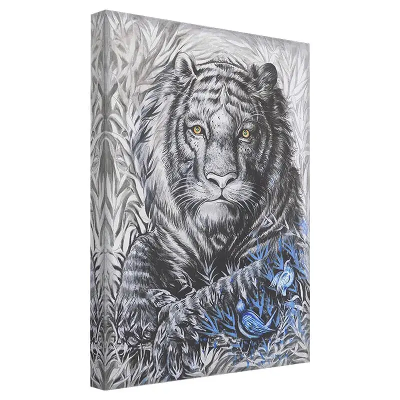
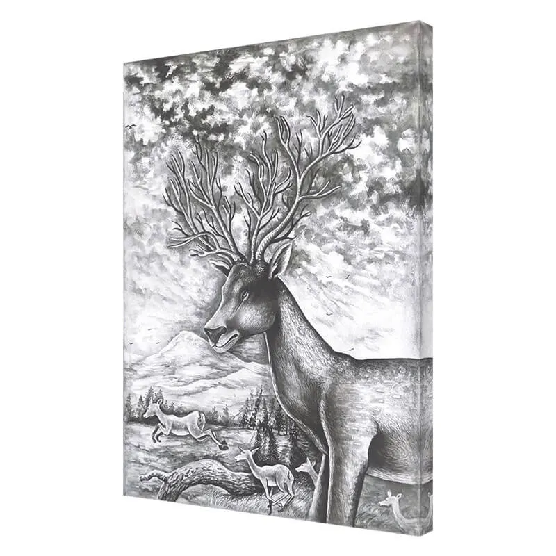
Monochrome and near-monochrome paintings are unusually well suited to gallery walls, since a shared tonal range naturally unifies even very different subjects, sidestepping one of the biggest risks of mismatched colors. A mix of animal portraits, landscapes, and abstracts can work beautifully together as long as they share a frame style or a limited palette. Avoid combining too many highly detailed, busy pieces in one dense cluster; the eye needs at least a few simpler, quieter pieces within the group to rest on between the more intricate ones.

Where Gallery Walls Work Best
Staircases and long hallways are natural fits, since a linear or ascending arrangement follows the movement of the space itself. Living rooms benefit from a gallery wall as a genuine focal point, especially on a large, otherwise plain wall. Home offices can take a smaller, more restrained gallery wall, though it’s worth keeping the arrangement simpler here to avoid visual overload during focused work. Bedrooms generally suit a gallery wall less well than other rooms, since the format tends to introduce more visual activity than a room built around rest usually wants, though a small, quiet, monochrome cluster can work in the right bedroom.
Mixing Sizes Without Losing Balance
A salon-style gallery wall almost always benefits from at least one clearly larger anchor piece, rather than a collection of uniformly small paintings. Without a dominant piece, the eye has nowhere obvious to land first, and the whole arrangement can feel flat despite having plenty of individual content. As a rough guide, aim for one large piece, two or three medium pieces, and the rest small, rather than an even split across all sizes.
Positioning a Gallery Wall Above Furniture
When a gallery wall sits above a sofa, bed, or console table, the whole arrangement should be sized and centered relative to that furniture piece rather than the wall itself, the same rule that applies to a single large painting. As a guide, the full width of the arrangement, including all the spacing between pieces, should span roughly 60-75% of the furniture’s width, with the bottom edge of the lowest frames sitting 15-20cm above the furniture. Treating the whole cluster as one unit for this calculation, rather than measuring individual frames, keeps the proportions looking intentional.
Renter-Friendly Gallery Walls
A multi-piece gallery wall might sound like it requires more wall damage than a single painting, but it’s actually one of the easier formats to adapt for a no-nails rental. Adhesive hanging strips rated for the weight of each individual frame let you build a full arrangement without a single hole, and because each piece hangs independently, you can adjust or remove one frame at a time without disturbing the rest of the layout, something that’s much harder to do gracefully with a single oversized painting.
Using Digital Tools to Preview the Layout
Beyond the paper-template method, a simple photo of your empty wall edited with basic image-editing software, or even a free layout-planning app, can help you visualize proportions and spacing before committing to the physical paper stage. This is particularly useful for a salon-style layout with many different-sized pieces, where getting a sense of the overall visual weight and balance in advance saves time during the physical planning stage.
Gallery Walls in Awkward or Irregular Spaces
Not every wall is a clean, uninterrupted rectangle. Light switches, thermostats, door frames, and sloped ceilings all complicate a gallery wall layout, but they don’t rule it out. A salon-style arrangement is generally more forgiving of these obstacles than a strict grid, since pieces can be shifted slightly to work around an interruption without breaking the overall visual rhythm. For a sloped ceiling or an angled wall, following the angle with a diagonal line of ascending or descending frames, rather than fighting it with a strictly horizontal layout, tends to look far more intentional.
Common Mistakes to Avoid
The single biggest mistake is skipping the floor-and-paper planning stage and hanging pieces directly, which almost always leads to a wall full of unnecessary holes and a layout that never quite settles into place. The second is inconsistent spacing within what’s meant to be a unified grouping, which reads as sloppy rather than intentional. The third is choosing pieces with no unifying thread at all, no shared color, frame, or subject connecting them, which tends to look like a random accumulation rather than a curated collection. The fourth is centering the whole arrangement too high on the wall, treating it like it needs to reach the ceiling rather than sitting at natural eye level.
Tools That Make the Process Easier
A laser level removes almost all the guesswork from keeping a grid layout genuinely straight, particularly across a wide arrangement where small errors compound quickly. Painter’s tape is useful for marking hanging points directly on the wall before committing to nails. A simple tape measure and a shared spacing measurement, decided in step five, keeps even a freeform salon-style layout from drifting into inconsistency as you work across the wall.
Framing for a Cohesive Gallery Wall
If you’re not confident mixing frame styles, matching frames across every piece is the safest route to a cohesive look, even when the subjects and colors vary considerably. If you do want to mix frame styles, keep the mix limited, two, at most three, distinct frame finishes repeated across the group, rather than a different frame for every single piece, which tends to fragment the wall’s overall sense of unity.
Living With and Adjusting a Gallery Wall Over Time
A gallery wall doesn’t need to be permanent or complete on day one. Many of the best ones evolve gradually, with a new piece added every so often as you find something that fits the established thread. Leave a small amount of intentional breathing room in your original plan if you expect to add pieces later, so a future addition doesn’t force you to completely re-plan spacing across the whole wall.
Frequently Asked Questions
How many pieces should a gallery wall have?
There’s no fixed number, but most successful gallery walls range from five to twelve pieces. Fewer than five tends to look sparse for the format, while significantly more requires very careful planning to avoid visual overload.
Can I mix photos and paintings in the same gallery wall?
Yes, this works well, particularly when photos are framed to match the painting frames, or when a shared color palette ties everything together despite the different mediums.
What’s the ideal spacing between frames?
Roughly 5-8cm for a formal grid layout, and a slightly looser but still consistent range for a salon-style layout, generally not exceeding 15cm between adjacent pieces.
Should a gallery wall be symmetrical?
Not necessarily. A grid layout is inherently symmetrical, but a salon-style layout is meant to feel organic and asymmetrical, as long as it’s still visually balanced overall, which is different from strict symmetry.
Do all the frames need to match?
No, but limiting yourself to two or three consistent frame finishes across the whole wall produces a more polished result than using a completely different frame for every piece.
What if I don’t have enough paintings yet to fill the wall I have in mind?
Plan the full layout in advance, including the pieces you don’t own yet, marked simply as blank paper templates, so you know exactly what size and orientation to look for as you add to the collection over time, rather than buying pieces that don’t quite fit the gaps.
Is a gallery wall a good idea for a small room?
Yes, particularly a grid-style arrangement, which can make efficient, organized use of a compact wall in a way that a single oversized painting sometimes can’t in a genuinely small space.
The Takeaway
A gallery wall rewards planning far more than it rewards taste alone. Choose a unifying thread, plan on the floor and then on paper before a single nail goes in, keep spacing consistent, and let one dominant piece anchor the whole arrangement. Follow those steps and even a modest collection of paintings can read as a genuinely curated, gallery-worthy wall.
Browse our full collection of original hand-painted artwork, created on canvas by our artists in India, to find pieces that suit your gallery wall.