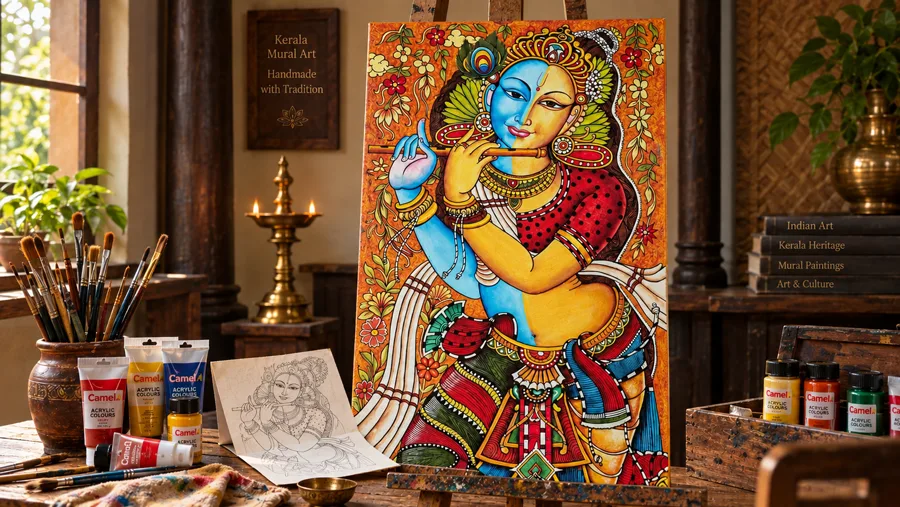
Color used to be the whole point of a painting. In 2026, some of the most striking pieces are doing the opposite — stripping color out entirely. Monochrome art is built from black, white, and every grey in between. In fact, it has moved from “artsy niche” to one of the most requested styles in home decor.
A good monochrome painting can be just as bold as a colorful one. Similarly, it just gets there through contrast and form instead of color.
Why Monochrome is a trend setter
Part of it is the broader shift toward “bold monochrome interiors.” These are rooms built around a single color family, in varied shades and textures. They avoid a mix of competing colors. A black-and-white painting fits perfectly into that room. Therefore, it doesn’t introduce a new color to manage.
There’s also a simple practical reason: monochrome art matches everything. Importantly, you don’t have to worry about clashing colors. There’s no color competition to worry about.
A Short History of Black-and-White Art
Interestingly, monochrome isn’t new. For one, ink wash painting used black and grey for over a thousand years. Similarly, black-and-white photography built an entire visual language around light, shadow, and form. What’s new is how deliberately it’s being used in interior design. Today, it’s a tool for calming busy, color-saturated rooms. Instead, it’s no longer just an art-world statement.
What Makes a Monochrome Painting Stand Out
Essentially, without color, it all comes down to three things: contrast, subject, and detail. High contrast — deep blacks against bright whites — gives a piece drama. Softer greys give it mood. The subject matters more too. Weak composition can’t hide behind color.
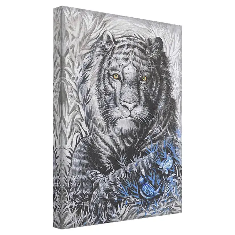
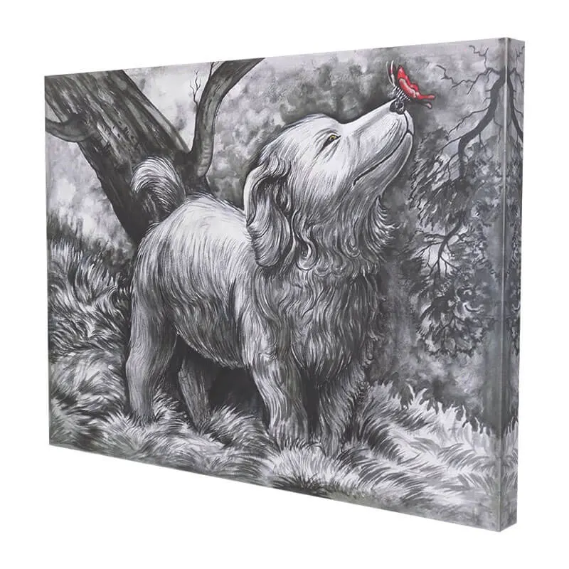
Clearly, this is the kind of piece that proves monochrome doesn’t mean muted. In fact, the drama here comes from light and shadow doing all the work color usually does.
The Range Within Monochrome
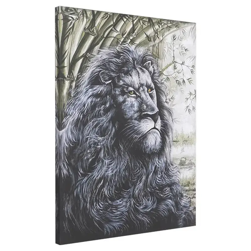
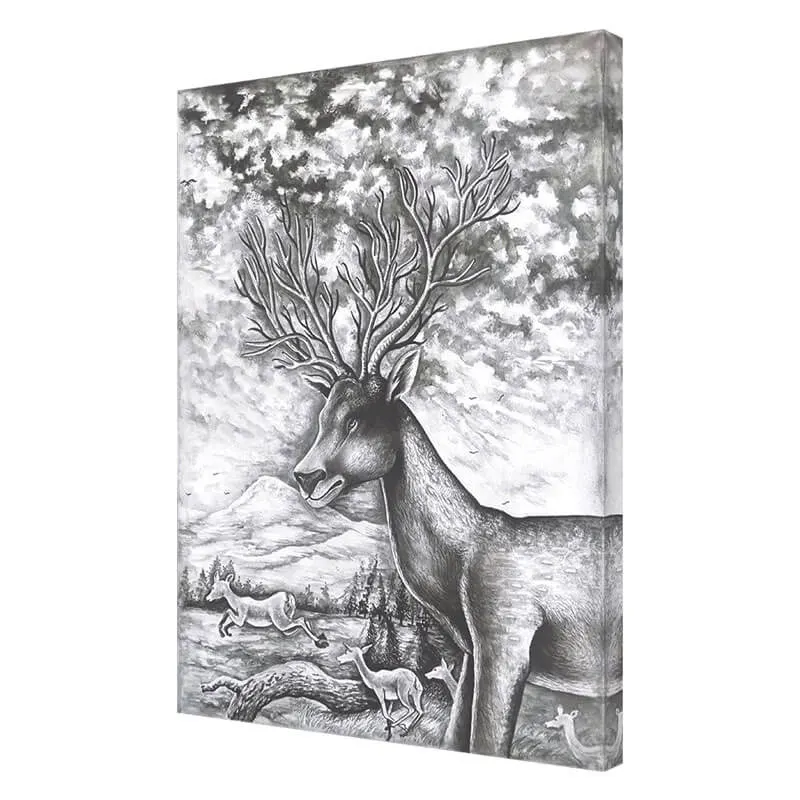
“Monochrome” covers more ground than plain black and white. True high-contrast pieces push toward pure black and white with very little grey. As a result, they read as the most dramatic and modern option. Soft greyscale work sits in the middle of the tonal range. Notably, it feels calmer, closer to an old photograph than a bold graphic statement. Furthermore, sepia or warm-toned monochrome swaps grey for warm browns and creams. This softens the effect and suits traditional or rustic interiors better.
Where Monochrome Paintings Work Best
Living rooms and hallways handle bold, high-contrast pieces well. Typically, these are rooms you pass through quickly, so drama reads nicely. In comparison, bedrooms tend to suit the softer, greyscale end of monochrome rather than stark black and white. Home offices benefit from monochrome. Specifically, it keeps the room sharp and focused without adding visual noise. Dining rooms can take a bolder monochrome piece too, especially one with an interesting subject that gives guests something to talk about.
Styling Tips
- Let the painting be the boldest thing in the room — keep furniture and walls neutral around it
- Black frames intensify the contrast; natural wood frames soften it
- Pair with metallic accents (brass, chrome) rather than colorful ones for a cohesive look
- One large monochrome piece beats several smaller ones in the same room
- If the room already has a bold color scheme, monochrome art acts as a visual break rather than competing for attention
Monochrome Art and Small Spaces
Because there’s no color to “add weight,” monochrome works well in smaller rooms. A busy, colorful piece might feel overwhelming in these spaces. A single black-and-white painting in a small space reads as deliberate. Multi-color pieces are much harder to pull off in this context.
Monochrome by Subject: What Reads Best Without Color
Some subjects genuinely suit monochrome better than others. Wildlife portraits gain drama in monochrome. Strong texture like fur or feathers becomes the focus when color is removed. Architecture and cityscapes fit well in black and white. Lines and structure read more clearly without color pulling attention elsewhere. Portraits take on timeless quality in monochrome. Color versions often lose this effect. Landscapes are trickier. Color carries much of the emotional weight. But a well-composed monochrome landscape can be just as striking, sometimes more so.
Building a Monochrome Gallery Wall
While a single large monochrome piece is usually the safest choice, a well-planned gallery wall of several smaller black-and-white paintings can work too, and it sidesteps one of the biggest risks of a colorful gallery wall: clashing palettes. Since every piece shares the same tonal range, mismatched pieces still look cohesive together in a way that would be much harder to pull off with a mix of colorful paintings. Keep the frame style consistent across the grouping, and vary the subject matter rather than the tone, so each piece adds something different without breaking the visual unity of the wall.
How Lighting Changes a Monochrome Painting
Monochrome art is more sensitive to lighting than colorful work, since contrast and shadow are doing all the visual work. Warm, yellow-toned lighting can shift a true black-and-white piece toward a subtle sepia cast, which some people like and others find muddies the effect. Cool, neutral white lighting preserves the crisp contrast better. A directional picture light, angled slightly from above, brings out texture in the brushwork that flat ambient lighting tends to flatten out entirely.
Original vs Print for Monochrome Work
Monochrome paintings depend heavily on subtle gradation — the exact point where a shadow shifts from dark grey to black, or the softness at the edge of a highlight. Prints, especially lower-quality ones, tend to crush these subtle transitions into flatter, less nuanced blocks of tone. An original canvas, painted by hand, preserves that gradation, which is often the entire difference between a monochrome piece that feels flat and one that feels genuinely dramatic.
Caring for a Monochrome Canvas
Dust gently with a soft, dry cloth, and avoid direct sunlight for long periods — while monochrome pieces don’t fade in the same visibly obvious way colorful paintings do, prolonged UV exposure can still yellow whites and soften blacks over time. Keep the canvas away from humidity and heat sources, and avoid touching the painted surface directly, since oils from skin can dull matte black areas over time.
Painting vs Photography: Why Choose a Hand-Painted Monochrome Piece
Black-and-white photography is everywhere, from stock prints to framed Instagram shots, which is exactly why a hand-painted monochrome piece stands out more than it used to. A painting interprets tone and contrast through brushwork rather than simply capturing it through a lens, and that interpretation, the deliberate darkening of one area, the soft blending at another, gives a monochrome painting a warmth and individuality that a photographic print rarely achieves. It also means no two monochrome paintings, even of a similar subject, ever look quite the same.
A Quick Buying Checklist
- Decide whether you want high-contrast drama or soft, greyscale calm before you start browsing
- Check whether the piece leans warm (sepia) or cool (true grey/black) in tone, since this affects which frame and lighting suit it
- Measure the wall first, and size the piece to roughly 60-75% of the furniture width beneath it
- If building a gallery wall, keep frame styles consistent and vary subjects rather than tones
- Confirm the piece is an original canvas if texture and gradation matter to you, since prints tend to flatten subtle tonal shifts
Frequently Asked Questions
Does monochrome art work with a colorful room, or only neutral ones?
It actually works especially well in colorful rooms, since it gives the eye a place to rest amid the color elsewhere. Think of it as a visual palate cleanser rather than something that only belongs in a neutral space.
Is monochrome the same as grayscale?
Not exactly. Grayscale specifically means shades of grey between black and white. Monochrome can also include sepia or single-color-family work, like a painting done entirely in shades of blue.
What frame color works best with monochrome art?
Black frames sharpen the contrast and suit high-drama pieces. Natural wood or white frames soften the look and suit the gentler, greyscale end of the style.
Can I mix monochrome and color paintings in the same room?
Yes — in fact, a monochrome piece often makes a great anchor for a room that also has one or two colorful accessories, since it keeps the overall look from feeling overloaded.
Final Thought
Monochrome painting isn’t a trend about playing it safe — it’s a trend about trusting form and contrast to do the job color usually does. Once you start looking for it, it’s easy to see why designers keep coming back to it.
Explore our full monochrome painting collection, hand-painted on canvas by our artists in India.