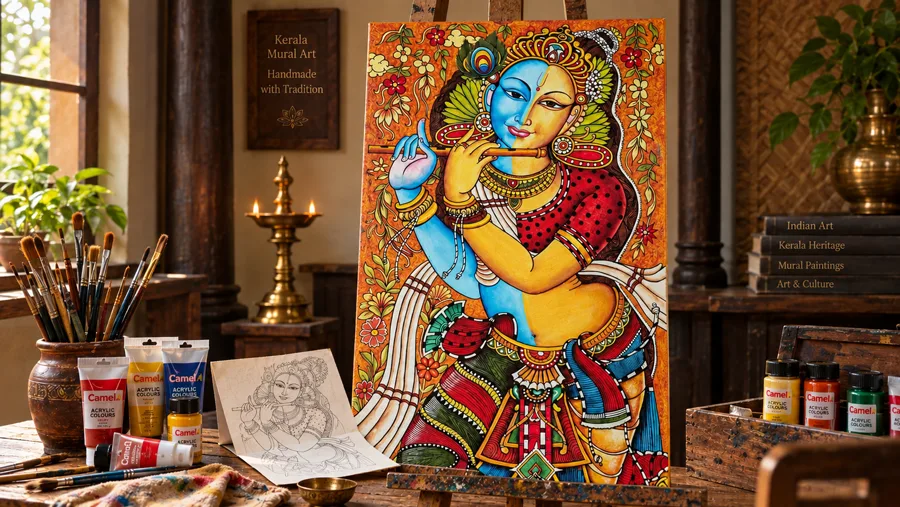
Walk into any home that feels genuinely designed rather than just decorated. Usually, there’s one piece doing most of the work: a big, confident abstract painting. Not a landscape you glance at once, not a print you forget is even there. Something with color and movement that pulls your eye in and holds it.
Abstract art has been quietly taking over living rooms, hallways, and home offices for a few years now. But 2026 is the year it stops being a “maybe” and becomes the default choice for anyone updating their walls. Here’s why it’s trending, and how to pick a piece that actually suits your space. We’ll also cover what to avoid, plus a few real examples to get you thinking.
Why Abstract Art Is Having a Moment in 2026
A few things are converging at once. Homes are getting more neutral — think warm beige, soft grey, cremèle tones. That means walls need something with energy to keep a room from feeling flat. Abstract work does that without fighting the palette, because you can choose one in almost any color story.
There’s also a shift toward art that says something about the owner rather than art that simply matches the sofa. An abstract piece doesn’t come with a fixed “meaning,” so it becomes personal. Two people can look at the same painting and read it completely differently, and that ambiguity is part of the appeal.
And practically speaking, abstract paintings are forgiving. A landscape has to match the room’s mood. A portrait has to match the room’s formality. Abstract art just has to match the room’s colors and scale. That makes it the easiest “big art” decision most people will make.
What Makes an Abstract Painting Work in a Room
Not every abstract piece works everywhere. Before you buy, it helps to think about three things: color, energy, and scale.
- Color — Pull one or two colors from the painting into the room through cushions, a throw, or a rug. It ties the piece to the space instead of leaving it looking bolted on.
- Energy — A painting with sharp lines and high contrast reads as energetic; soft, blended strokes read as calm. Match the energy to how you actually use the room. A bedroom rarely needs a painting that shouts.
- Scale — This is where most people go wrong. A small abstract painting on a large wall looks like it’s apologizing for being there. When in doubt, size up.
Understanding Abstract Styles Before You Buy
“Abstract” gets used as a catch-all term. But it actually covers a handful of quite different approaches, and knowing the difference makes shopping a lot easier.
Gestural abstraction is built from movement — sweeping brushstrokes, visible energy in every mark. It photographs well and tends to feel alive even from across a room. That makes it a strong choice for a large, empty wall that needs presence.
Color field work leans on broad areas of color rather than detailed brushwork. It’s quieter, more meditative, and works especially well when you want the painting to set a mood rather than demand attention.
Abstract figurative pieces keep a hint of a recognizable subject — a face, a body, a tree — but distort or simplify it. These tend to be the easiest “entry point” into abstract art for someone who’s never bought a non-representational painting before. There’s still something familiar to hold onto.
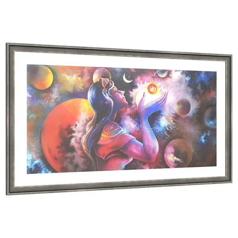
Surreal and fantasy abstraction pushes further — dreamlike scenes, impossible color combinations, imagery that doesn’t try to resemble anything in the real world. These make excellent conversation pieces. Still, they usually work best as a single statement rather than paired with other bold art nearby.
Abstract Art by Room
Living room: This is where you can go boldest. A large abstract canvas above the sofa or console table becomes the room’s anchor. Everything else — furniture, lighting, rugs — can be styled around it.
Home office: Choose something with movement rather than chaos. A piece with flowing lines or a limited palette keeps the room feeling alert without becoming distracting during a work call.
Bedroom: Softer palettes work best here — muted blues, warm neutrals, gentle gradients. Save the high-contrast, high-energy pieces for rooms you pass through rather than sleep in.
Entryway: A smaller abstract piece with strong color makes a great first impression without needing a huge wall to work with.
Dining room: Surreal or fantasy-leaning abstracts do well here. A dining room is usually a social space, so a slightly unusual, conversation-starting piece has room to be appreciated rather than lived with constantly.
A Few Original Abstract Paintings to Consider
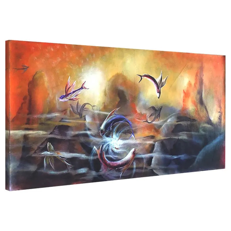
Here are a few hand-painted originals from our studio that show the range abstract art can cover — from color-drenched fantasy to quiet, gestural movement.
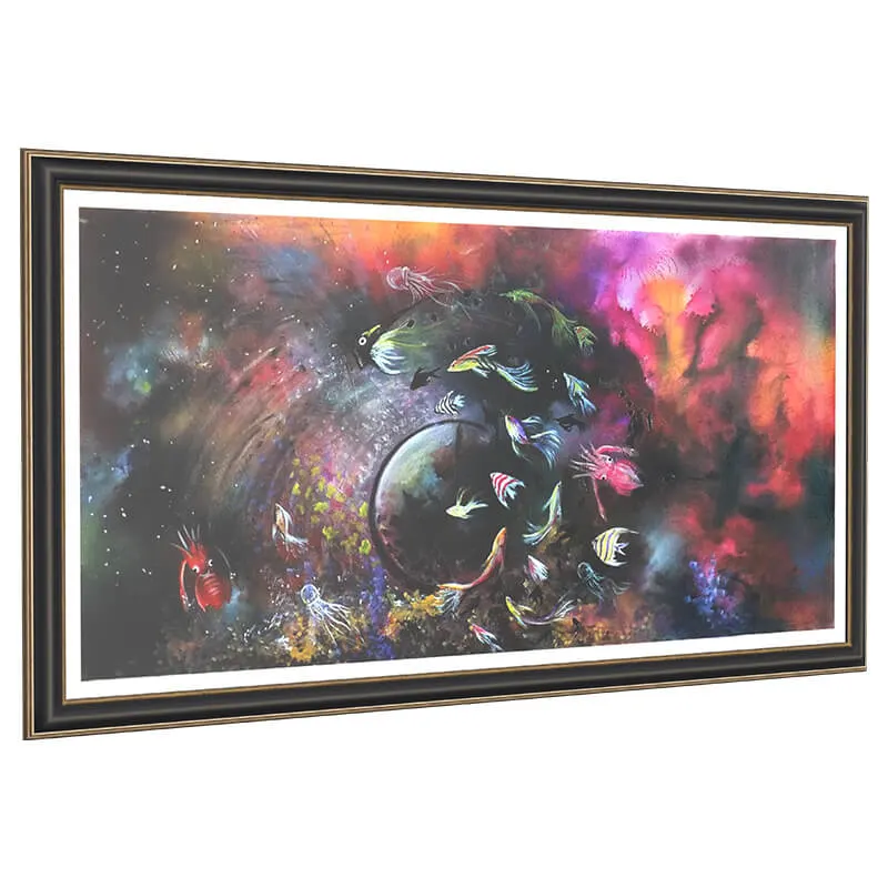
If your space leans more neutral, a piece like this brings in exactly the kind of energy a beige-and-grey room needs without clashing with anything.
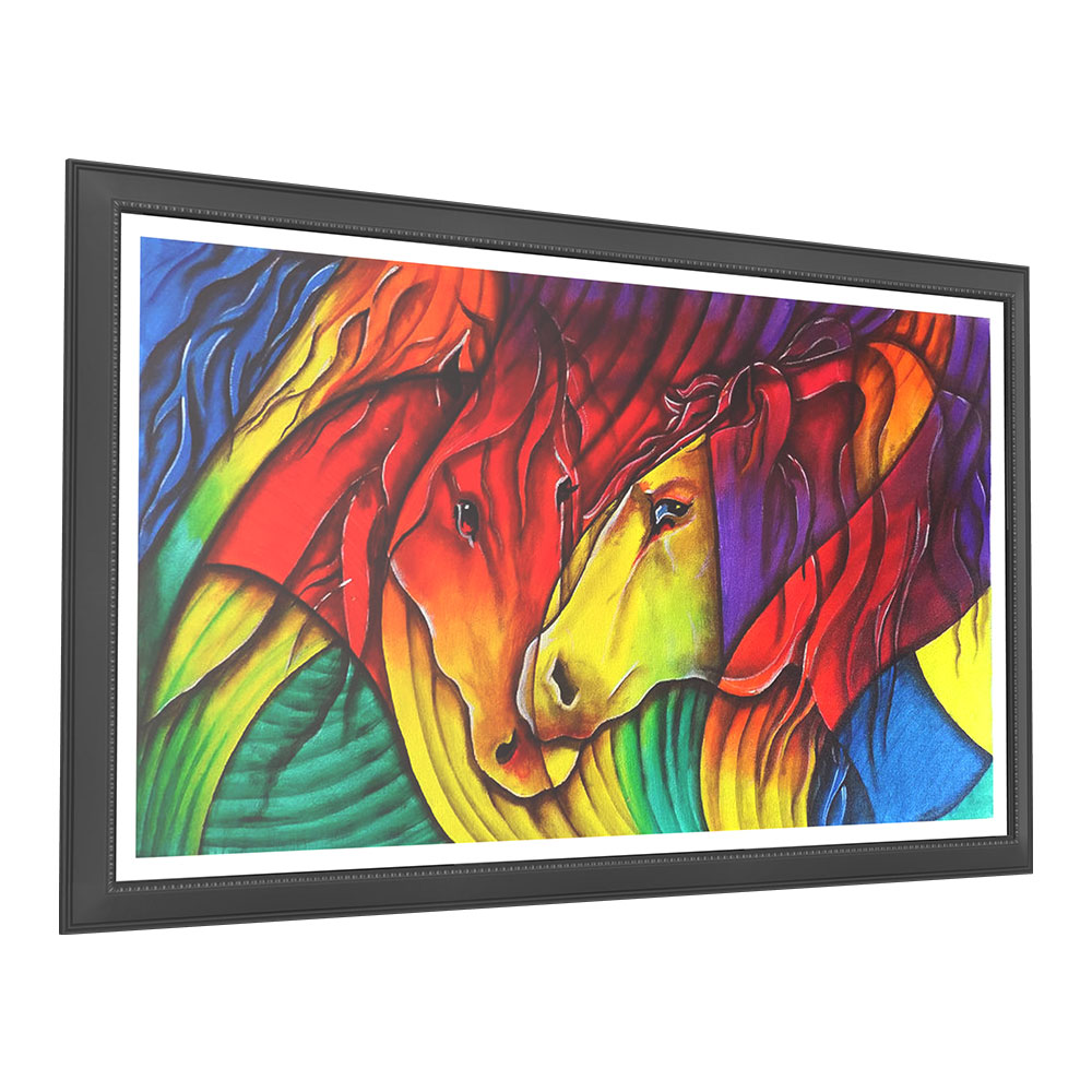
This one leans into movement rather than color — the kind of piece that rewards a second, closer look.

A more figurative take on abstraction, this piece works well in dining rooms or reading corners where you want something with character but not overwhelming scale.
Pairing Abstract Art with the Rest of Your Decor
An abstract painting doesn’t need to sit in isolation. Rugs, cushions, and even a single ceramic vase can echo one color from the painting without turning the room into a themed set. The trick is restraint. Pick one or two colors from the piece, not all of them, and repeat those in small doses elsewhere in the room. A painting with deep teal and gold, for instance, works well with a plain teal throw and a couple of brass accents. There’s no need to match every hue.
Texture is worth thinking about too. A heavily textured, palette-knife abstract painting pairs naturally with tactile furnishings — linen upholstery, a chunky knit throw, unfinished wood. A smooth, flat color-field piece, on the other hand, suits sleeker, more polished surfaces like glass or lacquered wood.
A Quick Checklist Before You Buy
- Measure the wall and the furniture beneath it before browsing — shop by size, not just by image
- Pick one or two colors you want the painting to echo, then search within that range
- Decide whether you want gestural, color field, figurative, or surreal — it narrows the options fast
- Check whether the piece is an original or a print, and confirm canvas size in centimeters, not just the thumbnail crop
- Plan for lighting at the same time you plan for the painting — don’t treat it as an afterthought
Common Mistakes People Make with Abstract Art
The single biggest mistake is buying too small. A 30x40cm abstract painting on a wall built for something twice that size will always look like a placeholder. It never reads as a finished decision. If you’re unsure, measure the wall first. Aim for a piece that covers roughly 60-75% of the width of the furniture beneath it.
The second mistake is choosing a painting that matches the current sofa exactly rather than the room’s overall tone. Furniture gets replaced far more often than art. A painting chosen only to match one specific cushion color will feel dated the moment that cushion does.
The third is hanging it too high. The center of the painting should sit at roughly eye level — around 145-155cm from the floor for most people. Don’t push it up near the ceiling to “fill space.”
Framing and Lighting
Most abstract paintings on canvas look best either unframed (gallery-wrapped, with the painted edges visible) or in a simple, thin frame that doesn’t compete with the composition. Heavy or ornate frames tend to fight with abstract work rather than complement it.
Lighting matters more than people expect. A picture light mounted above the frame, or even a well-placed floor lamp nearby, brings out the texture of the brushwork. Flat overhead lighting never does that. If the piece has heavy paint texture, angled light will cast small shadows across the surface. That adds depth you’d otherwise miss entirely.
Original vs Print: Does It Matter for Abstract Art?
More than most genres, actually. Abstract paintings rely heavily on texture. Think the ridge of a palette knife, or the thinning of paint at the edge of a brushstroke. A print flattens all of that into a smooth, uniform surface. If you’re investing in a statement piece, an original canvas is where the “statement” part really comes from.
Caring for an Abstract Canvas
Dust gently with a soft, dry cloth or a very soft brush, moving in one direction rather than scrubbing. Avoid direct, harsh sunlight for long stretches, since UV exposure can fade pigments over years. This matters more for bold, saturated abstracts than muted ones. Keep canvases away from direct heat sources like radiators or fireplaces. Heat can dry and crack the paint surface over time. Never use household cleaning sprays on a painted surface.
Frequently Asked Questions
Does abstract art go with traditional furniture?
Yes, more often than people expect. A bold abstract piece next to a traditional wooden dresser or a classic sofa creates contrast that reads as curated rather than mismatched. That works as long as the color palette has some connection to the room.
How big should an abstract painting be above a sofa?
Aim for roughly two-thirds to three-quarters of the sofa’s width. A three-seater sofa around 200cm wide typically suits a painting in the 120-150cm width range.
Can I mix two abstract paintings in the same room?
You can, but keep them on separate walls rather than side by side. Make sure they share at least one color so the room doesn’t feel visually split in two.
Is abstract art a good choice for a first-time art buyer?
Abstract figurative pieces are usually the easiest starting point. They keep a hint of a recognizable subject, while still giving you the freedom and color range abstract art is known for.
Bringing It Together
Abstract wall art isn’t a passing trend so much as a shift in how people think about their walls — less about matching, more about mood. Pick a piece for the feeling you want the room to have. Size it generously, light it well, and let the rest of the space respond to it rather than the other way around.
Every abstract painting on ASP Fine Arts is hand-painted on canvas by our artists in India. So no two pieces are ever identical. You can browse the full abstract paintings collection to find one that fits your space.